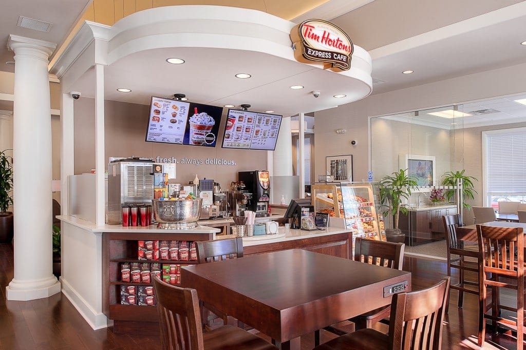
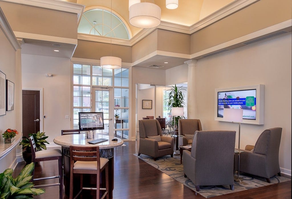
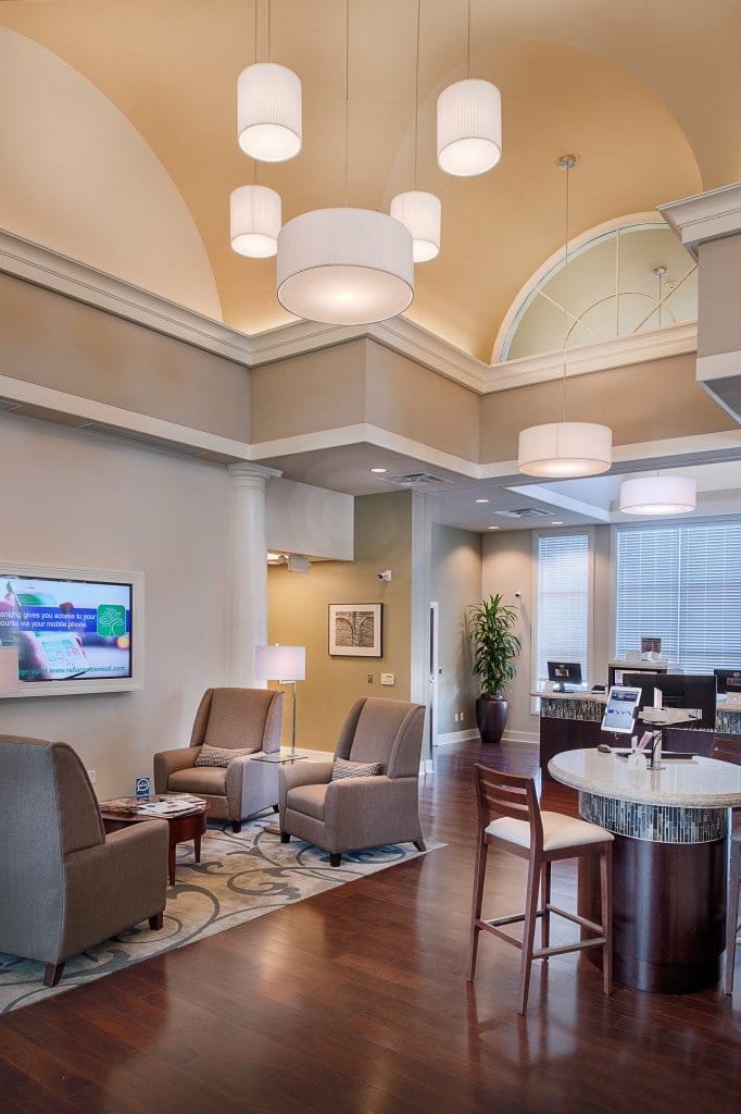
Bank design through the years has changed dramatically. With more people banking on-line, there is less opportunity for the staff to interact face to face with their customers – leaving cavernous branch facilities with too much real estate! So the question became – how do you bring more people into the bank allowing the staff the opportunity to sell more products and services. Reliance Bank, a St. Louis community bank, had an idea – integrate a prominent coffee chain in their lobby – and bring more people in!
The design team was challenged then to blend the classic detailing that is part of the banks brand with the brand and image of the coffee chain. Security of the bank was also a concern and again the design team collaborated to secure the appropriate bank areas when the coffee shop was open and the “bank” services were not.
A large meeting room that is adjacent to the coffee shop is designed to provide meeting space for the bank but can be booked by customers and non-customers alike as a community room – bringing more opportunities in to the facility
That was one of this bank’s goals when it started thinking about its new branch, which caters to a wide range of clients. As they started the design process, they knew that they wanted to do something different and unique to the area. They had already gone to the more contemporary “teller pod” and “tech center” design to replace the typical traditional teller line. They felt that working with someone who is not standing behind a huge teller line would make the experience more inviting and personal.
In addition, they tossed around the idea of adding a coffee shop to the lobby. The bank then teamed up with a prominent coffee chain, and designed a small kiosk into the main lobby of the bank. It was a great concept but would it work? There were many security issues that needed to be worked out, but in the end, it has been a huge success. The overall design of the space integrated some of the major coffee chain’s corporate standards, and blended them in with the overall design of the banks interior. The challenge for the bank was to make the coffee kiosk look like it was meant to be there without sacrificing their brand.
The client wanted the overall design of the bank to be more traditional, but with a contemporary flair. They wanted something that was light and bright but still very durable. The use of floor to ceiling glass demountable walls helped to open up the space and give it a more contemporary look, and the neutral color palate added to the overall timeless feel. Overall, the client has been thrilled with the outcome, and both young and old are loving the new concept.
size 2,300 sf
location Frontenac, MO
category Financial


